


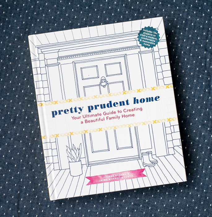
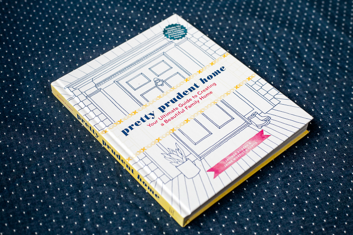
It’s a snowy March morning here in Texas but guess what just arrived on my doorstep to brighten my day? My first copy of our book, Pretty Prudent Home! Jaime had promised me that it would be an amazing feeling to hold my own book in my hands and she was right! I just wish that she was here, rather than in sunny California so that we could look at it together. Actually, I wish that I was there in sunny California, brrr. In honor of this exciting day, I thought I would share the story of the cover. We love it and think it’s perfect but the designer in me can’t help but explain the process that lead us to this beauty. Isn’t the illustration by Sonya Lee Benham perfect? I don’t think I will ever in my life get sick of looking at it.
If you too are looking forward to holding a copy in your hand, please go ahead and pre-order one just as soon as you can. Pre-orders are one of the key indicators of a book’s potential in the marketplace and it would be a huge favor to us if you would place an order before the book is even out. But enough of us asking you to buy the book (for now) let’s talk cover design.
Read on for all of the details and steps in creating our book cover!
The first round of cover designs from our publisher, Abrams, featured a wide range of concepts.
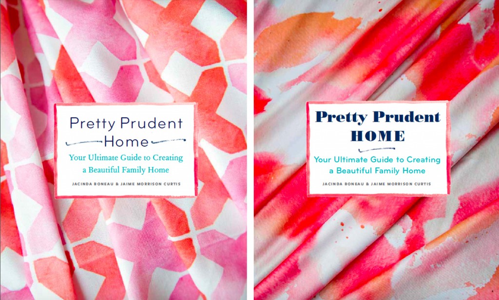
Since the interior of the book uses my watercolor patterns as design elements, designer Sarah Gifford incorporated my fabric into many of them in the first round.
She also explored photography like these great shots by book photographers Annie McElwain and Raya Carlisle, and Dallas Photographer Kelly Christine Sutton.
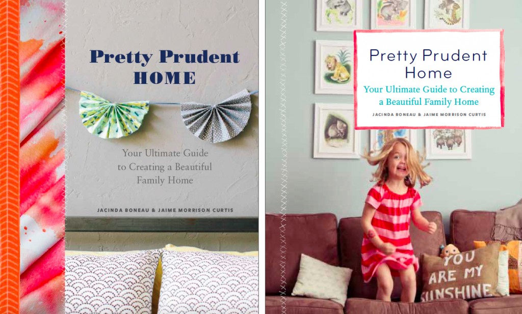
As well as layering graphics, photography and illustrations….
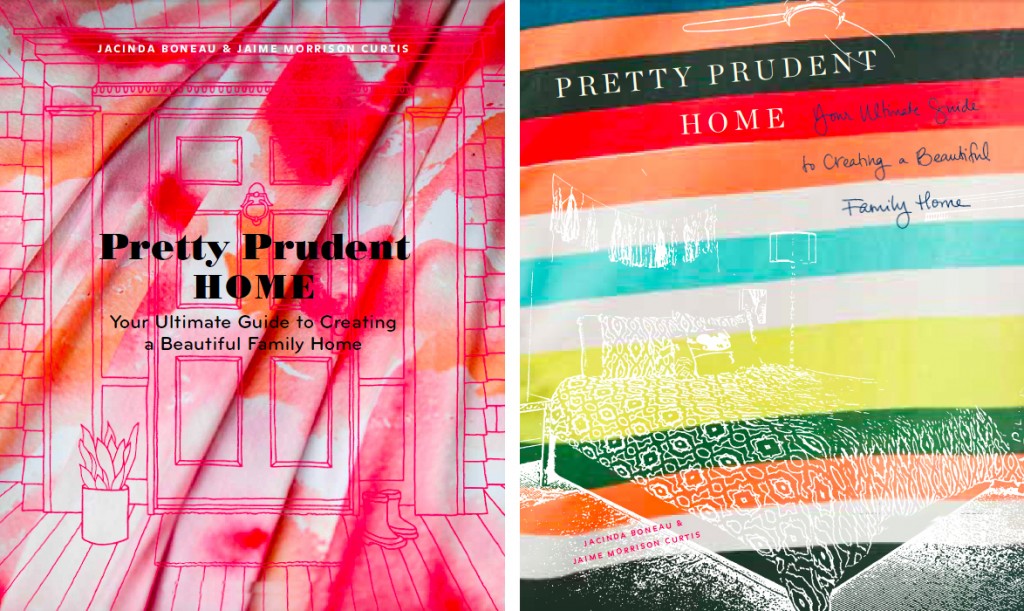
And finally going more simple with Sonya’s bold illustrations. We were pleased. We all agreed that this type of cover design was a classic and represented the book well as a whole. We were especially drawn to the idea of a welcoming front door as the entry into this book all about creating a beautiful (and prudent) family home.
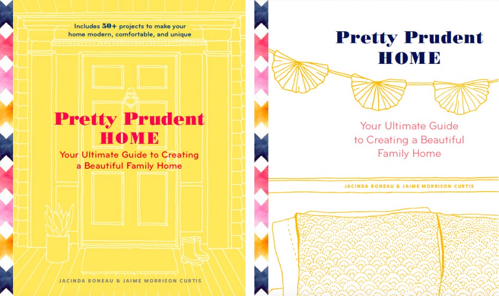
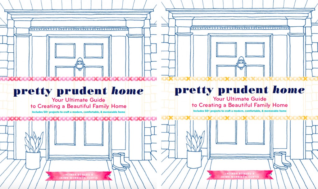
From there it went off to make the rounds with our publisher, Abrams. We then saw a fresh new round which explored the door illustration in many color combinations, with an emphasis on making the title “pop” more. We had initially really loved yellow but once we saw this round the answer was clear. Not yellow…
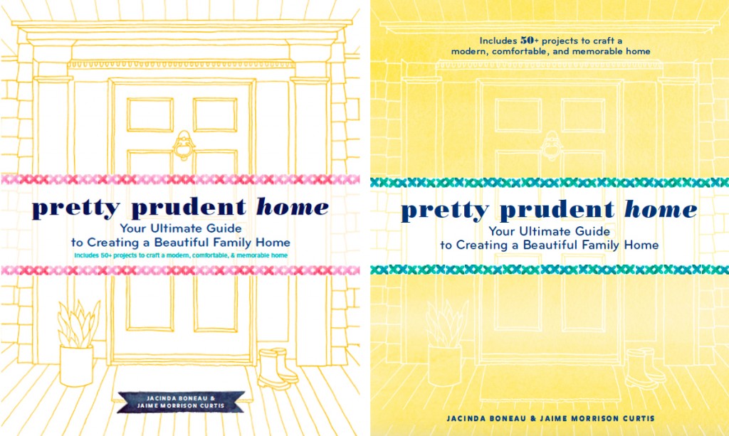
Not even our own signature Pretty Prudent Turquoise.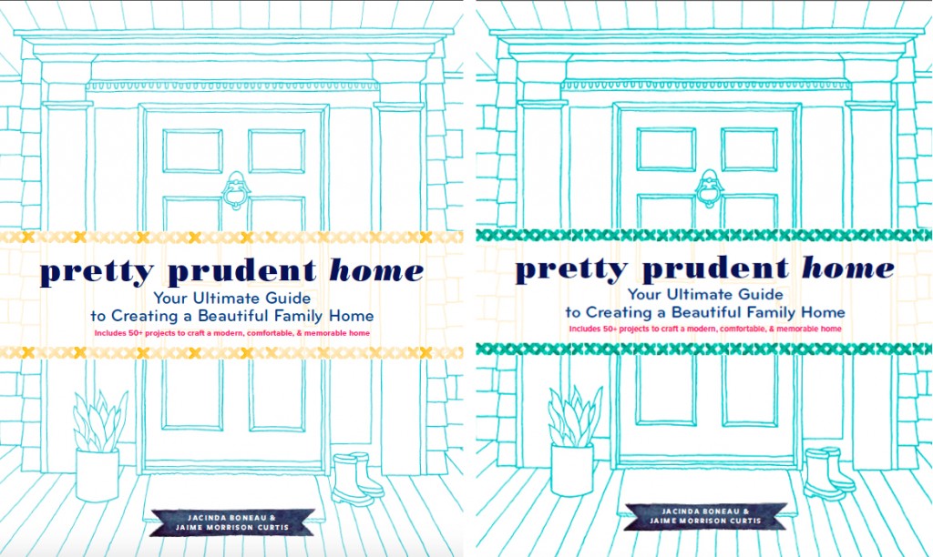
But crisp navy on white. It was modern and classic at the same time and felt like a blueprint, which is just perfect for our intentions with this book.
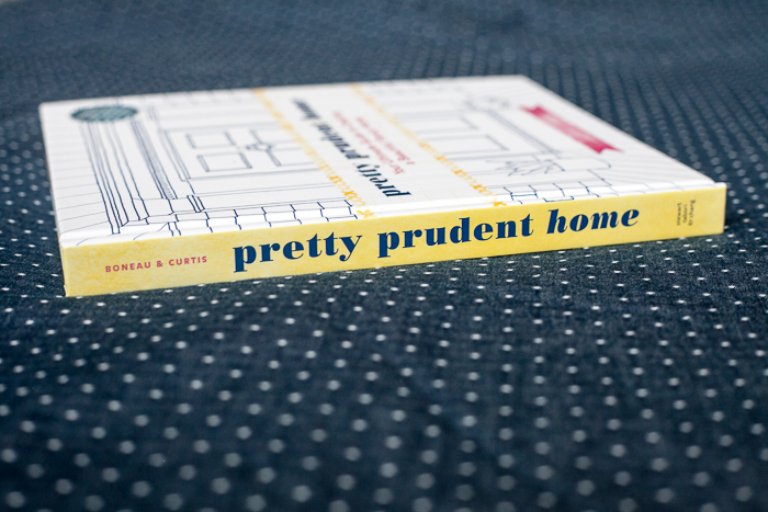
So with a few tweaks it was off to press and now one is sitting here in my hands. What do you think? Tell us that you love it and it’s perfect because there is no going back now! No really, unlike a blog post, you can’t change a thing. Weird.
We are so excited to share this process here on Pretty Prudent. Feel free to ask us any questions about the art of book writing/making/selling etc and we will happily share all that we know.
And in the meantime, did I mention that it’s available for pre-order?!?
Cannot wait to get it in my hands!
Congratulations awesome women!
So dang EXCITING!! I’m ordering my copy today. 🙂 Congratulations!!
I ordered five, I hope they arrive for Easter gifts!
You have got a cool design. I often pay attention to these things! I work in a game studio myself and do character and environmental design for computer games. Cool when you can do your hobby and get paid for it.